How to Build React Native Swipe Cards Inspired by Tinder

Whether you’re building a React Native Tinder Clone or an original dating app, you’ll eventually end up implementing the UI for React Native Swipe Cards. At Instamobile, we built a Tinder cards component in React Native, for our Tinder Clone app. If you’re looking to learn how to build an app like Tinder in React Native, this tutorial is the perfect place to get started from.
Did you use Tinder? If yes, then you may be familiar with the swiping functionality where a right swipe means “like” and a left swipe means “dislike”. For those who don’t know, two users swipe right on each other, then they can start chatting in the app. In today’s article, we are going to make a Tinder-like card swiper component in React Native.
The card swiper component provides an amazing look and feels to display information. I hope you are not new to React Native because we have already discussed how to setup React Native and other stuff in previous tutorials. After setting up React Native, let’s create an image array which will be shown on swipes. Take a look at the code given below:
Implementing the Main Swipable Image View
Firstly, we are going to create an array of images. It is just a simple array of images, coded in pure JavaScript.
const Foods = [
  { id: "1", uri: require("./assets/1.jpg") },
  { id: "2", uri: require("./assets/2.jpg") },
  { id: "3", uri: require("./assets/3.jpg") },
  { id: "4", uri: require("./assets/4.jpg") },
  { id: "5", uri: require("./assets/5.jpg") },
];
Let’s now define the view layer for card swipers like dimension, width, and height. Preparing the card stage:
render() {
    return (
      <View style={{ flex: 1 }}>
        <View style={{ height: 60 }}>
        </View>
        <View style={{ flex: 1 }}>
          {this.renderUsers()}
        </View>
        <View style={{ height: 60 }}>
        </View>
      </View>
  );
For cross-device compatibility, we are getting the device width and height from an environment variable, which is dynamic and corresponds to the device’s height and width. We use Dimension and store the values into two constants:
import { StyleSheet, Text, View, Dimensions, Image } from "react-native";
const SCREEN_HEIGHT = Dimensions.get("window").height;
const SCREEN_WIDTH = Dimensions.get("window").width;
Animating Images with Animated View
Animated is the library that we are using it to create beautiful UI animations, such as the Tinder-like Swipe animation. It ships with React Native, so we don’t need to add any extra packages.
Let’s import the animation library first, and then we can start using it in our project.
import {
  StyleSheet,
  Text,
  View,
  Dimensions,
  Image,
  Animated,
} from "react-native";
Add an image to the view layer of our app to make sure that the initial style is working as expected. We can now use Animated.View, as shown in the React Native code snippet below:
<View style={{ flex: 1 }}>
  <View style={{ height: 60 }} />
  <View style={{ flex: 1 }}>
    <Animated.View
      style={[
        {
          height: SCREEN_HEIGHT - 120,
          width: SCREEN_WIDTH,
          padding: 10,
        },
      ]}
    >
      <Image
        style={{
          flex: 1,
          height: null,
          width: null,
          resizeMode: "cover",
          borderRadius: 20,
        }}
        source={Users[0].uri}
      />
    </Animated.View>
  </View>
  <View style={{ height: 60 }} />
</View>
As you can see, we first add the Animated library to our project. After that, we add the animated view for the animation on screen/ Notice how we use device height and width for defining the style. This ensures the Tinder cards will be displayed correctly on all device sizes.
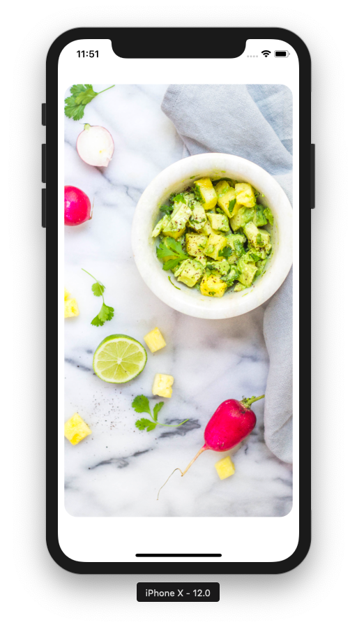
Secondly, we are going to add an image and use width and height from their container. We also add a little bit of styling to make the image fit well within the container.
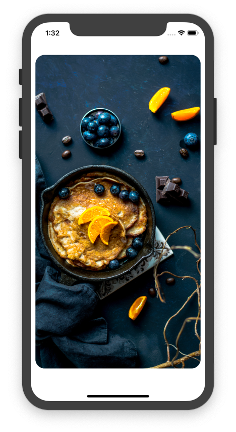
To specify the image URL source, we are using the hardcoded array, which we added at the beginning. Run your app on your iPhone or Android and you should see the following outcome:
Generating React Native Swipe Cards Stack
In the next step, we are generating the React Native Swipe Cards stack with the swipable images. I have created a new function that is being used for rendering the images from an array with the map iterator.
renderFoods = () => {
  return Foods.map((item, i) => {
    return (
      <Animated.View
        style={{
          height: SCREEN_HEIGHT - 120,
          width: SCREEN_WIDTH,
          padding: 10,
        }}
      >
        <Image
          style={{
            flex: 1,
            height: null,
            width: null,
            resizeMode: "cover",
            borderRadius: 20,
          }}
          source={item.uri}
        />
      </Animated.View>
    );
  });
};
As you can see, we grab each animated image by leveraging the map method, then we get the image URI from the array with the help of an iterator variable. But with this code, we get a warning from the compiler as shown in the picture. Let’s dive in deeper and code a little bit more to mitigate the compiling warnings.
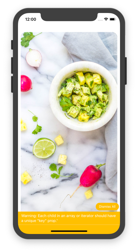
The compiler tells us to add a unique key to each child node, so let’s do that first.
<Animated.View
   key={i}
   style={{
   height: SCREEN_HEIGHT - 120,
   width: SCREEN_WIDTH,
   padding: 10
   }}
>
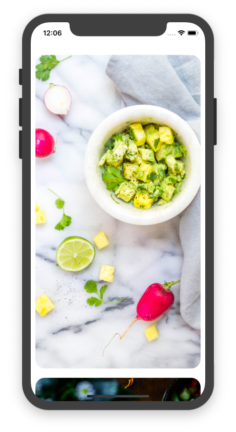
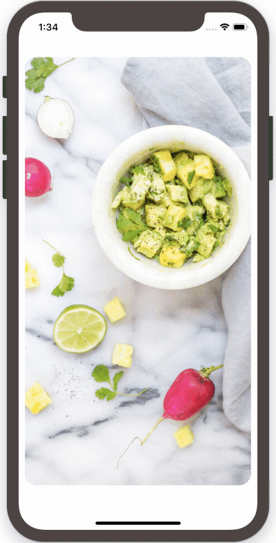
Ok, let’s run our dating app again. The warning should be gone, but the images don’t stack up quite as we’d like.
To solve this new issue just arose, let’s improve the theming, by using an absolute position for the Tinder cards:
<Animated.View
    key={i}
    style={{
        height: SCREEN_HEIGHT - 120,
        width: SCREEN_WIDTH,
        padding: 10,
        position:'absolute'
    }}
>
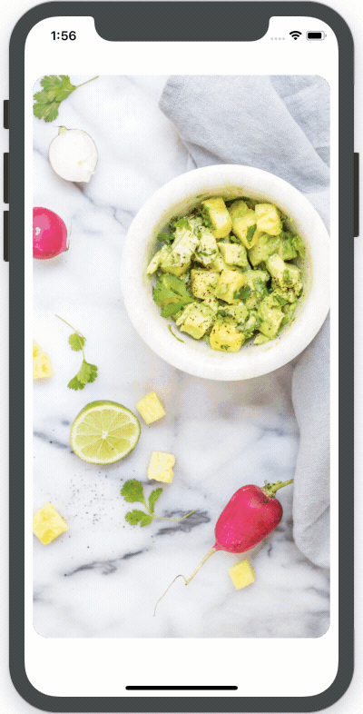
Now, your app should display the images stacked nicely.

Card Dragging Functionality with PanResponder
Now that we have all the UI layer figured out, the time to tackle the hardest part arrived: dragging, animating and rotating. In this section, we are dealing with the animation movement. For that, we need to import one more library called Panresponder.
import {
  StyleSheet,
  Text,
  View,
  Dimensions,
  Image,
  Animated,
  Panresponder,
} from "react-native";
Ship faster with All Access. Get the React Native templates, admin panels, updates, and launch bonuses that help you build faster.
Explore All AccessLet’s initialize a panresponder event and add the library to the component.
componentWillMount() {
    this.PanResponder = PanResponder.create({
      onStartShouldSetPanResponder: (evt, gestureState) => true,
      onPanResponderMove: (evt, gestureState) => {
      },
      onPanResponderRelease: (evt, gestureState) => {
      }
    })
}
What we are doing in the above code? In this code snippet, we are creating a PanResponder object and assign it to the component. After that, we are adding three methods onStartShouldSetPanResponder for initializing, onPanResponderMove event handler for the moving gesture and onPanResponderRelease for the gesture of the release event handler.
Next, we connect the gesture position to the Animated Library by using Animated.ValueXY. Create a constructor and a new variable for handling the vector position:
constructor() {
   super();
   this.position = new Animated.ValueXY();
}
Let’s assign the vector value with onPanResponderMove. We use the setValue method and then get XY value from gestureState.
componentWillMount() {
    this.PanResponder = PanResponder.create({
      onStartShouldSetPanResponder: (evt, gestureState) => true,
      onPanResponderMove: (evt, gestureState) => {
         this.position.setValue({ x: gestureState.dx, y: gestureState.dy });
    },
      onPanResponderRelease: (evt, gestureState) => {
      }
    })
}
Let’s now connect the event handler and the animation object to work together. We apply the event handler to the Animation stage and apply a vector position to style:
<Animated.View
  {...this.PanResponder.panHandlers}
  key={item.id}
  style={[
    { transform: this.position.getTranslateTransform() },
    {
      height: SCREEN_HEIGHT - 120,
      width: SCREEN_WIDTH,
      padding: 10,
      position: "absolute",
    },
  ]}
>
  <Image
    style={{
      flex: 1,
      height: null,
      width: null,
      resizeMode: "cover",
      borderRadius: 20,
    }}
    source={item.uri}
  />
</Animated.View>
Let’s try out the first movement implementation. Look at the screen below:
Limiting Panresponder to only the first card
Currently, you can see that every image in the image stack is moving while we are using gestures. But we need to apply an event handler so that only the first card moves when using our gesture animation. To do that, we define the first index position. With the help of the index position, we will be able to access the first image from the image stack of the array.
constructor() {
    super()
    this.position = new Animated.ValueXY()
    this.state = {
       currentIndex: 0
    }
}
Now, we apply the pan animation to the first index only:
return Foods.map((item, i) => {
  if (i < this.state.currentIndex) {
    return null;
  } else if (i == this.state.currentIndex) {
    return (
      <Animated.View
        {...this.PanResponder.panHandlers}
        key={i}
        style={[
          { transform: this.position.getTranslateTransform() },
          {
            height: SCREEN_HEIGHT - 120,
            width: SCREEN_WIDTH,
            padding: 10,
            position: "absolute",
          },
        ]}
      >
        <Image
          style={{
            flex: 1,
            height: null,
            width: null,
            resizeMode: "cover",
            borderRadius: 20,
          }}
          source={item.uri}
        />
      </Animated.View>
    );
  } else {
    return (
      <Animated.View
        key={i}
        style={{
          height: SCREEN_HEIGHT - 120,
          width: SCREEN_WIDTH,
          padding: 10,
          position: "absolute",
        }}
      >
        <Image
          style={{
            flex: 1,
            height: null,
            width: null,
            resizeMode: "cover",
            borderRadius: 20,
          }}
          source={item.uri}
        />
      </Animated.View>
    );
  }
});
Now refresh your screen again and move the first image again:
If you are following along with me then you can see it’s doesn’t work. Because the first image on which we are applying the animation is on the bottom of the stack and the image that you see is the last index. So what should we do? It’s easy. Let’s reverse the stack with the reverse method:
return Foods.map((item, i) => {
      .....................
}).reverse();
Refresh the mobile app again. Boom! Now you can see that only one image is moving. Let’s define the movements and gesture for the React Native Swipe Cards.
Designing the Tinder Cards Movement
As you saw before we can move a Tinder Card to any path, in any direction. This is not like the Tinder Swipe and we want to build a perfect Tinder clone, so let’s design a correct card movement, in order to build an app like Tinder. So first, we limit the card moving curve:
this.rotate = this.position.x.interpolate({
  inputRange: [-SCREEN_WIDTH / 2, 0, SCREEN_WIDTH / 2],
  outputRange: ["-10deg", "0deg", "10deg"],
  extrapolate: "clamp",
});
We create a variable named rotate. In this variable, we will call interpolate() on this.position. interpolate()is a method that is available to be called on any Animated.Value and it interpolates the value of the coordinate, before updating the UI property (e.g. mapping 0–1 to 0–100).
So in our example:
inputRange is a length of the area that the animation can reach. The first value is for moving to the left, the second value is an initial value, the third value is for moving right.
outputRange when moving right the card will drop -10 deg and when moving left the card will drop 10 degrees. The second variable is the initial value, and extrapolate is used to prevent the output value from exceeding outputRange.
Next, we apply the transform property.
this.rotateAndTranslate = {
  transform: [
    {
      rotate: this.rotate,
    },
    ...this.position.getTranslateTransform(),
  ],
};
Ship faster with All Access. Get the React Native templates, admin panels, updates, and launch bonuses that help you build faster.
Explore All AccessApply the property to the animation stage as well:
} else if (i == this.state.currentIndex) {
        return (
          <Animated.View
            {...this.PanResponder.panHandlers}
            key={i}
            style={[this.rotateAndTranslate,
              {
                height: SCREEN_HEIGHT - 120,
                width: SCREEN_WIDTH,
                padding: 10,
                position: "absolute"
              }
            ]}
          >
Now, when you swipe to left and right you can see that the swipe cards are being dragged exactly like in the Tinder app.
Adding Like/Nope Labels
Let’s add a little bit of text showing “Liked” or “Nope” labels, exactly like in the Tinder’s app. Inside the first card, we add two text components on top of the card.
<Animated.View
  {...this.PanResponder.panHandlers}
  key={i}
  style={[
    this.rotateAndTranslate,
    {
      height: SCREEN_HEIGHT - 120,
      width: SCREEN_WIDTH,
      padding: 10,
      position: "absolute",
    },
  ]}
>
  <Animated.View
    style={{
      transform: [{ rotate: "-30deg" }],
      position: "absolute",
      top: 50,
      left: 40,
      zIndex: 1000,
    }}
  >
    <Text
      style={{
        borderWidth: 1,
        borderColor: "green",
        color: "green",
        fontSize: 32,
        fontWeight: "800",
        padding: 10,
      }}
    >
      LIKE
    </Text>
  </Animated.View>
  <Animated.View
    style={{
      transform: [{ rotate: "30deg" }],
      position: "absolute",
      top: 50,
      right: 40,
      zIndex: 1000,
    }}
  >
    <Text
      style={{
        borderWidth: 1,
        borderColor: "red",
        color: "red",
        fontSize: 32,
        fontWeight: "800",
        padding: 10,
      }}
    >
      NOPE
    </Text>
  </Animated.View>
  <Image
    style={{
      flex: 1,
      height: null,
      width: null,
      resizeMode: "cover",
      borderRadius: 20,
    }}
    source={item.uri}
  />
</Animated.View>
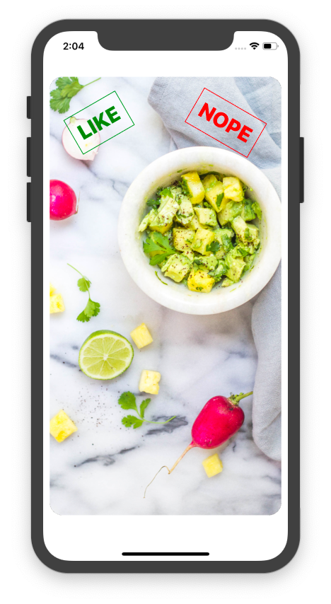
Restart the React Native app and now you can see that it looks exactly like Tinder:
Adding opacity
At first, the text should be hidden and then it will fade-in on the screen while the user swiping through the dating profiles.
inputRange defines an area that the animation can move to: first value means left, third value means right.
outputRange defines how value change when the animation moves left or right.
this.likeOpacity = this.position.x.interpolate({
  inputRange: [-SCREEN_WIDTH / 2, 0, SCREEN_WIDTH / 2],
  outputRange: [0, 0, 1],
  extrapolate: "clamp",
});
As you can notice, the difference between “Liked” and “Nope” when moving to the right, the value will increase and when moving to the left, the opposite value will increase instead:
this.nopeOpacity = this.position.x.interpolate({
  inputRange: [-SCREEN_WIDTH / 2, 0, SCREEN_WIDTH / 2],
  outputRange: [1, 0, 0],
  extrapolate: "clamp",
});
Then after add function to the animation stage.
 <Animated.View
    style={{
      opacity: this.likeOpacity,
      transform: [{ rotate: "-30deg" }],
      position: "absolute",
      top: 50,
      left: 40,
      zIndex: 1000
    }}
  >
    <Text
      style={{
        borderWidth: 1,
        borderColor: "green",
        color: "green",
        fontSize: 32,
        fontWeight: "800",
        padding: 10
      }}
    >
      LIKE
    </Text>
  </Animated.View>
  <Animated.View
    style={{
      opacity: this.nopeOpacity,
      transform: [{ rotate: "30deg" }],
      position: "absolute",
      top: 50,
      right: 40,
      zIndex: 1000
    }}
  >
    <Text
      style={{
        borderWidth: 1,
        borderColor: "red",
        color: "red",
        fontSize: 32,
        fontWeight: "800",
        padding: 10
      }}
    >
      NOPE
    </Text>
</Animated.View>
Now you can play with the result as shown below:

Adding the Next Card Effect
We are adding an animation to the next card with opacity, fade-in and scale increase.
inputRange and outputRange have the exact same definitions as before:
this.nextCardOpacity = this.position.x.interpolate({
  inputRange: [-SCREEN_WIDTH / 2, 0, SCREEN_WIDTH / 2],
  outputRange: [1, 0, 1],
  extrapolate: "clamp",
});
this.nextCardScale = this.position.x.interpolate({
  inputRange: [-SCREEN_WIDTH / 2, 0, SCREEN_WIDTH / 2],
  outputRange: [1, 0.8, 1],
  extrapolate: "clamp",
});
Then apply these transformations to the next card:
<Animated.View

    key={item.id} style={[{

    opacity: this.nextCardOpacity,

    transform: [{ scale: this.nextCardScale }],

    height: SCREEN_HEIGHT - 120, width: SCREEN_WIDTH, padding: 10, position: 'absolute'

    }]

}>
Now you can see the smoother animation with various effects:
Releasing a Tinder Card
As you can see on Tinder, when released at some point, the card will be gone. To implement this releasing behavior, we are going to implement an onPanResponderRelease event handler. Animation.spring allows us to define values that will animate from the start to the end, without having to define a specific amount of time (as opposed to timing, for example).
When we move the card over (as we define as left or right) then we use animation spring to create a new value and set a new index:
onPanResponderRelease: (evt, gestureState) => {
        if (gestureState.dx > 120) {
          Animated.spring(this.position, {
            toValue: { x: SCREEN_WIDTH + 100, y: gestureState.dy }
          }).start(() => {
            this.setState({ currentIndex: this.state.currentIndex + 1 }, () => {
              this.position.setValue({ x: 0, y: 0 })
            })
          })
        } else if (gestureState.dx < -120) {
          Animated.spring(this.position, {
            toValue: { x: -SCREEN_WIDTH - 100, y: gestureState.dy }
          }).start(() => {
            this.setState({ currentIndex: this.state.currentIndex + 1 }, () => {
              this.position.setValue({ x: 0, y: 0 })
            })
          })
        }
If the card did not reach the action threshold (so it needs to fall back), we define a position that helps spring move it back to default:
else {
    Animated.spring(this.position, {
       toValue: { x: 0, y: 0 },
       friction: 4
       }).start()
    }
}
And finally, we did it. You can see the final result on the screen. Here are your React Native Swipe Cards inspiredy by Tinder. Congratulations, you’ve just built a Tinder clone:
Recap
In this React Native tutorial, we have learned an advanced lesson of React Native. We have discussed animations, controlling the animation axis and effects as well as work with animated images. We have finally made what we have promised — a Tinder-like swiping card in React Native.
We hope you learned something that you can use in your project. If you are building your own dating app in React Native, consider using our Dating App Template, to avoid reinventing the wheel. The React Native Swipe Cards is just a small piece of it, you’ll have to put in 100x more effort to build a complete dating app from scratch – think only how much time it’d take you to hook the swipe cards to a Firebase backend for instance.
You can find the final source code on this Github React Native Tinder repo.
If you like this tutorial as well as the final piece of code, just share it out with others. If you get stuck anywhere, just leave a comment in the section below and we’ll be more than happy to help you out. Happy Coding!
Next Steps
Now that you have learned about webview in React Native, here are some other topics you can look into
-
Firebase — Push notifications | Firebase storage
-
How To in React Native — WebView | Gradient| Camera| Adding GIF| Google Maps | Redux | Debugging | Hooks| Dark mode | Deep-link | GraphQL | AsyncStorage | Offline |Chart | Walkthrough | Geolocation | Tinder swipe | App icon | REST API
-
Authentication — Google Login| Facebook login | Phone Auth |
-
Best Resource – App idea | Podcast | Newsletter| App template
If you need a base to start your next React Native app, you can make your next awesome app using manyReact Native template.