Optimize Onboarding Screens for Mobile Growth
Entrepreneurs, designers, and developers tend to separate Growth aspects from the mobile app development process. They are usually perceived as completely different focus areas. After all, what does marketing have to do with app development, right? Because of this, many startups fall into the trap of building onboarding screens that are so beautiful it blows the user’s mind, but they are not optimized for Growth, hence don’t convert well.
What is Growth for a Mobile App?
Sorry to break it to you, but Growth is not marketing. Growth is your entire business. Startups rise and fall on Growth. To become successful, you need to have growth – it’s the only thing that matters for a mobile business that’s just getting started. As a result, absolutely everything you do needs to gravitate around boosting growth: app features, app development, app design, data analytics, marketing, partnerships, etc. Growth dictates all the features of your app. Everything you do has to target the increase of metrics in a pillar of growth: acquisition, activation, retention, resurrection. This includes all of your onboarding screens, which is what we are going to focus on in this article.

What Companies Should Focus on Growth?
I hope I made my point already and the answer is obvious by now: all companies. Ever since I started Instamobile and dived into the mobile app development market, I was amazed by how rarely people have Growth in mind. Most of the app development companies and mobile app builders I found on the market fall into this trap: they design and code complex gorgeous apps that never become successful for the exact same reason you sign a contract with them: complexity and great design. This is crazy: you pay more money just to fall into the trap of your app not getting any traction. The incentives of a mobile app development company or freelancer are not aligned with Growth principles: they make more money by selling more features, more complexity, and more eye-catching designs. By definition, all these things hurt growth.
A Few Onboarding Screens Examples
Let’s randomly pick two high growing apps and compare them with two random onboarding screens we find on a site selling mobile app templates.
Ship faster with All Access. Get the React Native templates, admin panels, updates, and launch bonuses that help you build faster.
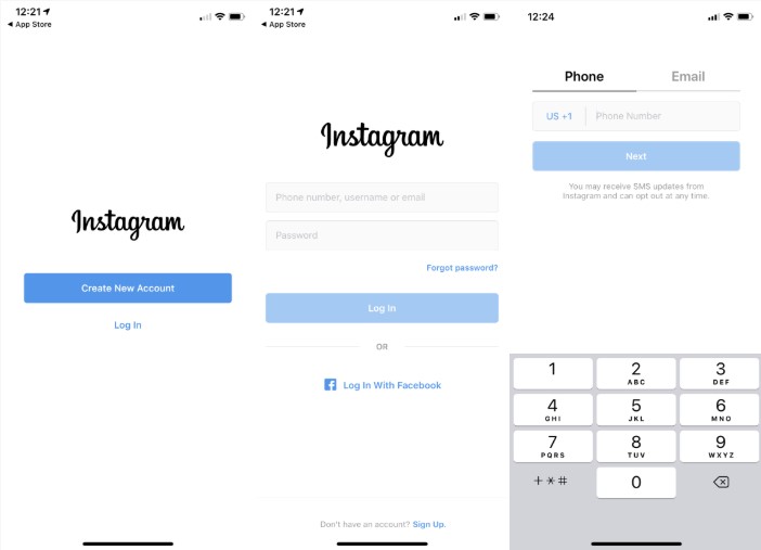
Explore All AccessInstagram Onboarding Screens
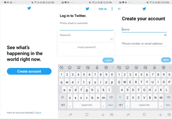
Twitter Onboarding Screens
Now, let’s take a look at a couple of random Dribbble shots, that depict the UI Kit trends in general. I’m talking about all the marketplaces selling UI Kits, mobile app templates, mobile app makers, freelancers, etc. First of all, every single UI Kit contains a Walkthrough Flow (source):
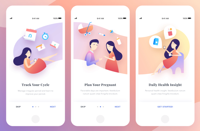
More Onboarding Screens
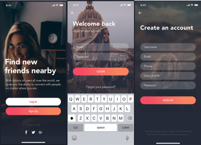
Do you notice any differences? These shots are stunning designs. I absolutely love them. You’ll pay more for these designs than for Twitter or Instagram’s designs. But they won’t convert your users optimally. They are optimized for blowing your mind, but not for growth.
How to Optimize Onboarding Screens for Growth
Just by looking at the examples above, we can learn from high growth companies how to optimize onboarding screens for Growth. Here are several Growth principles to apply to your onboarding screens. I strongly believe in these and I’m applying them to all of our React Native Templates. The first one is extremely important and you can think about it as the golden rule of user onboarding.
-
Onboarding Screens must optimize for Account Access
- The only goal of onboarding is for the user to get into their account, either by registration, login or account recovery. There shouldn’t be any other side goal to this.
- This goal is extremely important for new users since this is where you must collect their contact point (phone number or e-mail). Being able to reach to your users via e-mail or phone is crucial to your business and this is the only chance you get to try it. Don’t fuck it up.
-
A walkthrough does not optimize for Account Access
- Never use a walkthrough flow. It just distracts users from getting into their account. Do not waste their time. They already spent a few minutes installing your app. Get them into an account as soon as possible.
- As stated above, onboarding screens need to be optimized for Account Access, and a walkthrough tutorial flow is not achieving that in any way
- If you still feel like you need a walkthrough flow, here are two tricks on how to do it with Growth in mind:
- Improve your landing screen copy – a clever sentence can replace 100 walkthrough screens.
- Show the walkthrough flow AFTER the user logged in - In this way, you get a chance to collect their e-mail address, you get a signup/login without the friction of a walkthrough screen. It’s more important to collect a crucial component (e-mail) than to walk your user through your apps’ features. Prioritize!
-
Keep the design as clean as possible
- A clean design is a modern look. Don’t get impressed by crazy beautiful visuals. They suck!
- Avoid adding too much text. Keep it short.
- Copy should be easy to understand. Don’t make users think. A 5-year-old should understand in 5 seconds what you’re saying.
- Don’t use heavy/highly visual design assets, such as background images, videos, gifs, etc. These only distract the users from getting into their god damn account. Remove that background image and your drop-off rate will plummet.
- Keep the number of buttons low. Ideally, you should only have a single CTA per screen. I know your tendency is to have everything: Login with Google, Login with Facebook, Login with Twitter. Use just ONE. The more buttons you have, the higher the drop off rate. Users get distracted and confused – they need to choose what to click on – the decision gets harder, so they just close the app.
-
Keep the clicks count low
- Ideally, a user shouldn’t need to tap more than twice to get into an account. And that’s including sign up!
-
Ask only for critical information
- In general, you only need to ask for a contact point and a password.
- As a result, your forms shouldn’t have more than two fields. You can ask for gender and age later. Wait? Do you really need those?
- Ask for optional information AFTER they get into the account.
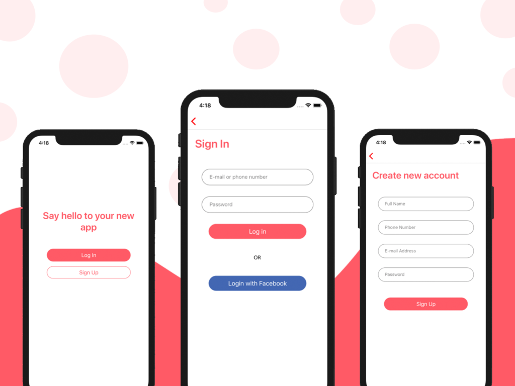
Our React Native Starter Kit encompasses all these user growth principles. Take a look at its clean design and notice how easy it is for an average user to log in. There are no distractions on the screen, very few input fields and all the call to actions are clear.
Looking for a custom mobile application?
Our team of expert mobile developers can help you build a custom mobile app that meets your specific needs.
Get in TouchConclusion
Don’t get fooled by intuition. More features and more complexity have a negative effect on Growth. All focus areas of your business should incorporate user growth principles, including the onboarding screens. To optimize onboarding screens for growth, you need to make it as easy as possible for your users to get into their account. Do not distract them with anything else. To learn strategies and get inspiration on this kind of optimizations, you can always download and learn from successfully highly growing mobile apps. Definitely pay attention to Growth from day zero, when you hire a software development entity – a clean, growth-optimized product will save you money and maximize your chances to succeed.